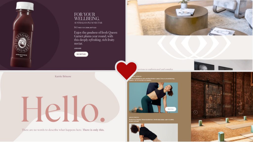
Take a look at these featured web designs I saw this month! This month’s collection includes:
- Plums are royalty
- Stretching with friends
- Scroll your heart out
- Mysterious design
5: Plums are Royalty
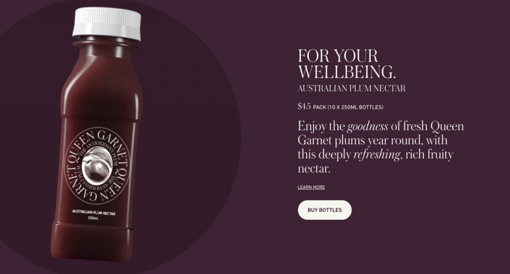
This website’s design makes plum juice seem really fancy and upper-class. I’ve never had the urge to try plum juice, but maybe today is that day. I really like the color theme, using dark purples and white for simplicity and richness. The choice of a serif font elevates the brand’s classiness and rich appeal. The site limits its imagery to product shots and a background image of plums every so often. No stock photos in sight. I also love the subtle animations of the images and text blocks as you scroll down – not interfering with the experience, but enhancing it.
6: Stretching with friends
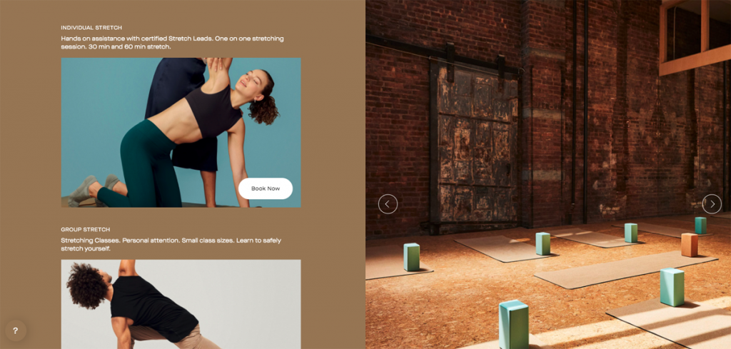
Did you know you could spend $30-$100 for “guided stretching?” This website’s design focuses on the ambience of their space, paired with medical statistics to convince you to give it a try. They also emphasize testimonials, which help potential customers understand the benefits of this slightly unusual service. One thing I don’t love about the design is that many of the headings are set in a font size smaller than the body text. This is quite unusual and I don’t think it is very effective on this site. To me, it looks more like a mistake than a stylistic choice. What do you think?
7: Scroll your heart out
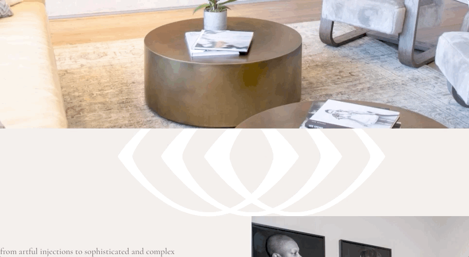
This website uses a scrolling motif that follows you down the page. I’m not sure how I feel about it, since it doesn’t really fit into the content in any way. Do you like it, or not? I often include motifs in my designs based on elements of a brand’s logo or colors. For example, on a previous client’s site their logo was a flower, so I used leaf imagery throughout the site to tie the design into the logo. However, in the example pictured above, the motif is very strong and adds strange contrast changes when scrolling through a text section.
I do like this site’s design other than the scrolling motif. The typography is beautiful, and the imagery is artfully placed, giving site visitors a sense of calm and balance, reflecting the services and benefits of the salon.
8: Mysterious Design
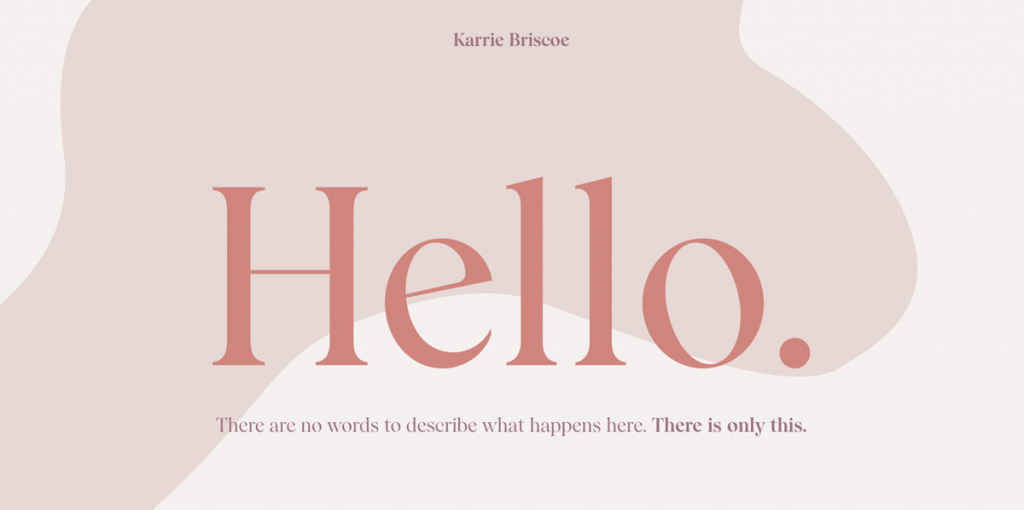
This site design is so intriguing. I love the organic shapes that flow between the sections. Unfortunately, I can’t 100% identify what the service offered is, but it definitely makes me curious! I think it’s some sort of therapy or counseling service, or maybe some sort of religious or mental practice? Unfortunately, the beautiful design can’t make up for clarity of purpose.
At the bottom of the site, it explains that the cost is $250 per session! I’d definitely recommend that if your company is selling something at that price point, you really want to clarify what your service is, and how clients will benefit from it. But, maybe I’m just not the target audience of this person’s services, and others would be attracted to the mystery?