Take a look at my favorite web designs I saw this month! This month’s collection includes:
- Sparkling smiles
- Falling shapes
- Fun at work
- Geniusly simple
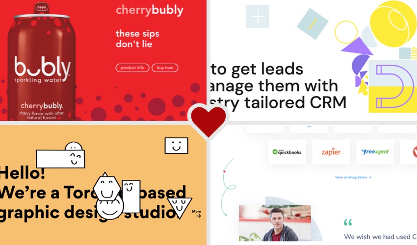
Sparkling Smiles
Ever since seeing this sparkling water brand in the grocery store for the first time, I loved their conversational language and simple humor in their brand. Each flavor has a short version of “hello” on the can tab, and a unique smiling face on the back. I can honestly say, the first time I bought Bubly, it was almost 100% because I thought the branding was so adorable.
This brand’s web design matches every aspect of the personality in their products. The headlines are short and quirky, and the colors are bright and cheerful. The design itself is pretty simple – with product shots being the main imagery, solid color backgrounds, and repeated use of the circle pattern. Their website just makes me happy – simple as that.
Do you love Bubly (or Bublé) as much as I do?
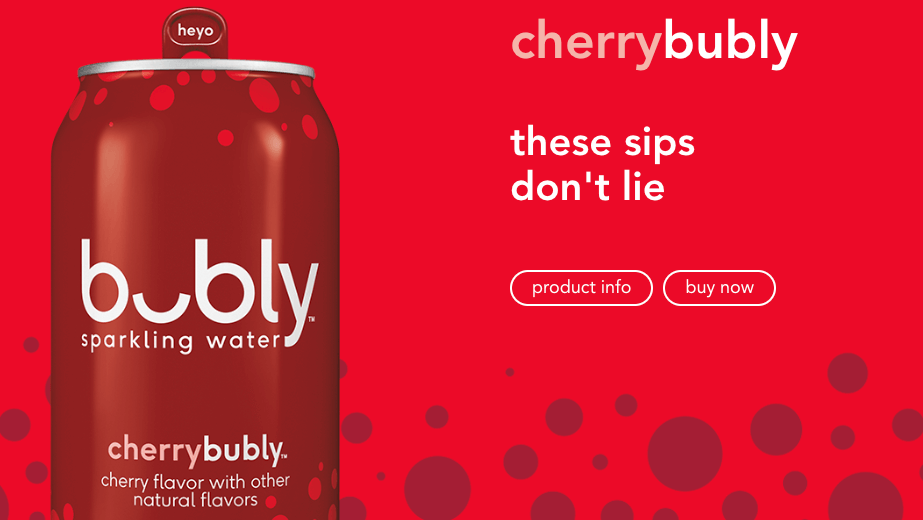
Falling Shapes
Geometric shapes are definitely popular right now in web design. Take a minute and load this page, and watch as the shapes drop into the screen. Mesmerizing, no? This website takes geometric shapes to the next level – using them as a motif throughout each visual and graphic on the homepage.
I also love the little animations on this page. Nothing too crazy – but these animations draw my eye down the page and make me want to keep reading. My favorite animation is in the dark section of the page, where you see the “magnet” icon that seems to magically attract the testimonial which animates towards the magnet. Fun, simple, and really draws you to read that testimonial.
Do you like this new trend of geometric shapes?
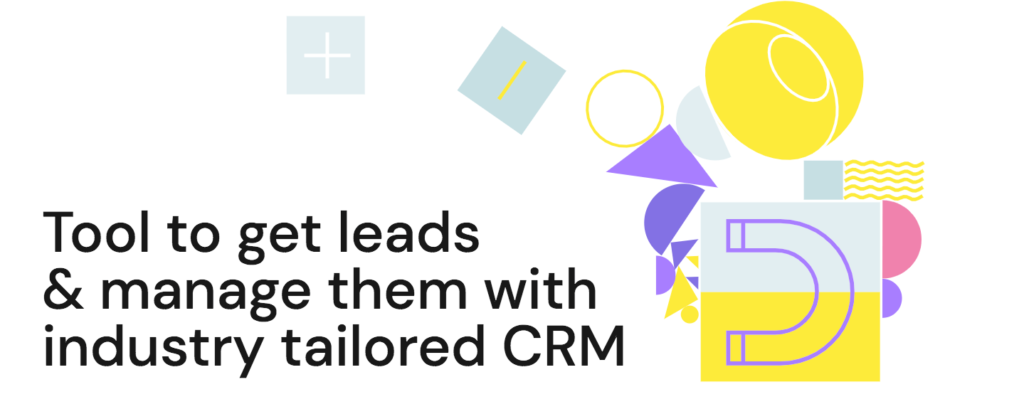
Fun at Work
Graphic design companies can get away with a lot of fun in their website designs. Take a look at this website and pick out all the quirky, whimsical elements at play here. I think it was pretty brave of their designer to choose to cover up some of the words in their top headline with these smiling shapes. Though that choice did help me realize that you can drag the shapes around.
These types of interactions are pretty fun – though what is the point of them? My best guess is that, as a graphic design agency, they can add some of these non-conventional design features to differentiate themselves and add a little fun. Plus, their design style seems to attract clients that want a fun, quirky style – based on their portfolio. How could you add just a little bit of fun into your brand?
Geniusly Simple
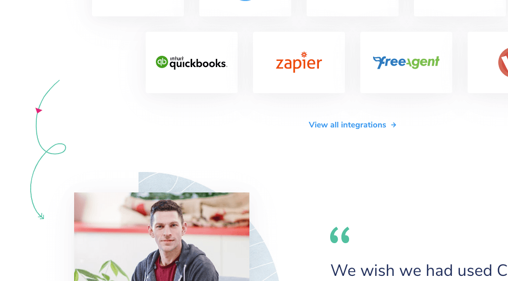
This is one of my favorite design techniques I’ve seen lately. It’s not flashy. It’s not some crazy animation that probably took 20 hours to create. It’s simply an arrow graphic leading the user from one section to another. This is such a great way to keep users scrolling and reading through your homepage.
The squiggles with arrows pointing down between sections make it hard to stop exploring this page! They also point out important information, like their free trial button. Stay tuned – I may be using this design technique soon somewhere.