Take a look at my favorite (and least favorite) web designs I saw this month! This month’s collection includes:
- An interactive graph I can’t stop sliding around
- Web design pet-peeves
- Quiz-style sales
- A beautifully complex animation
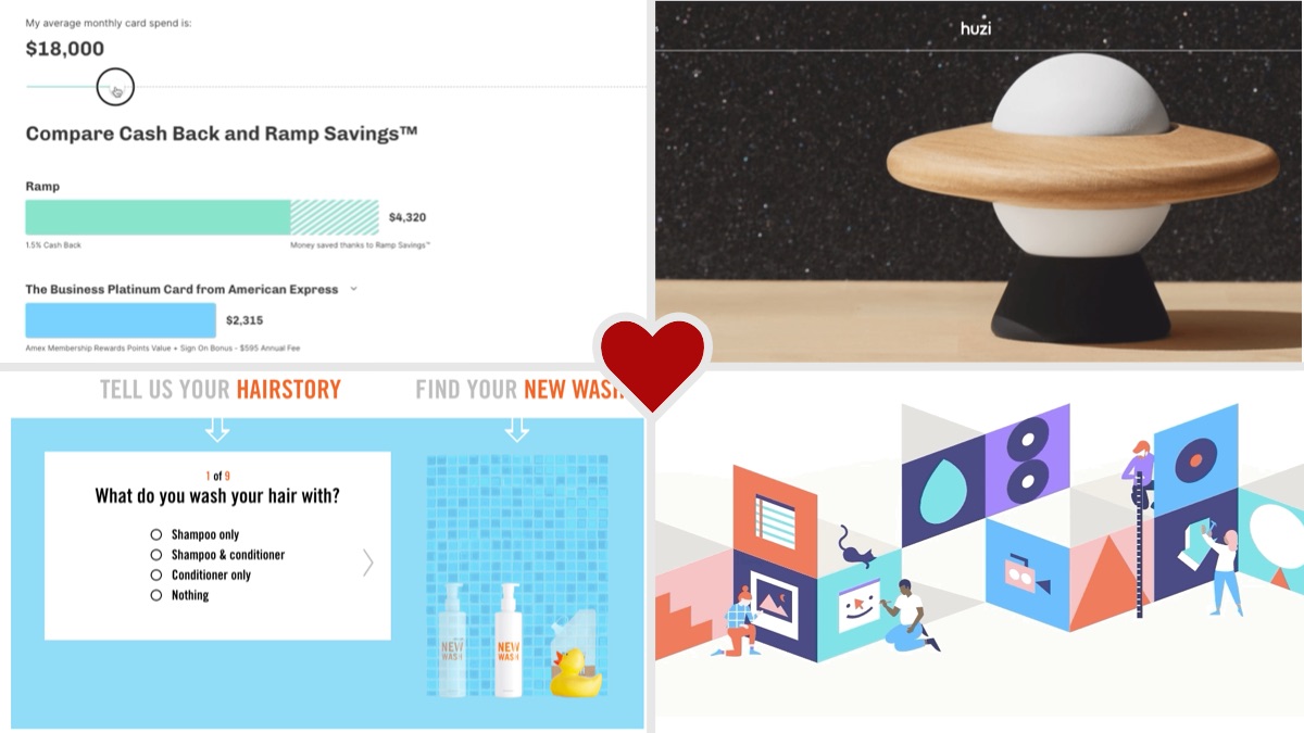
An interactive graph I can’t stop sliding around
Isn’t this graph animation and interaction cool? What a great way to show customers how much they could save with this product. Instead of showing static figures, graphs, and statistics, this company chose to let their users create their own personalized chart. It lets a customer know exactly the amount they could earn – not just “average customer” earnings. It helped me understand the savings much more clearly and trust that those savings were actually possible.
We’re taught in junior high English class: “show, don’t tell.” How could your company show how your product impacts users, rather than just tell them about it?
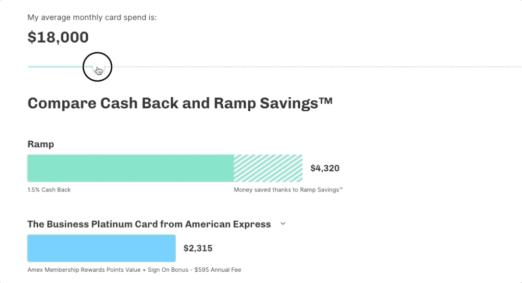
Web Design Pet Peeve
What do you think the above website is for? After asking people on social media, responses I got included:
- Modern art? 🤣
- An egg protector? 🤣
One of my biggest web design pet peeves is when you can’t tell what the business is/does from the homepage. Minimalism can be great – but make sure your business’ purpose shines through. This website is a perfect example of this problem. It took me a few minutes on this site to understand anything about the company and what they are offering (turns out it’s durable toys). Even scrolling down the homepage, I found absolutely no context or explanation. I had to go to the “About” page, which is also quite sparse, before I found out what the site was actually selling.
Make sure your website visitors can understand the purpose of your website within 3 seconds of the page loading. If users don’t understand what you’re offering, they’ll leave your site and find another (probably your competitor 😫).
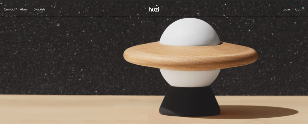
Quiz-style sales
This website uses an online quiz to help users find their perfect product. People love taking quizzes like “What Disney character are you?” Why not apply that to hair care? This creativity is why I love this design. It makes users feel like the brand is personalizing their products just for them. Their quiz results show them products that are custom made for their hair.
I’m guessing this site’s users are much more likely to purchase the product after taking the short quiz. Why? Because the site is doing all the research for them! No need to sift through all the site’s products to find the right one. The site does it for you! People love to save time, and this type of quiz-style marketing really saves users time. Take the quiz and see for yourself.
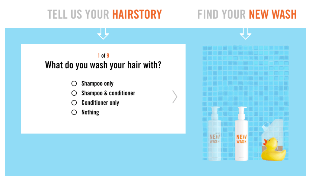
A beautifully complex animation
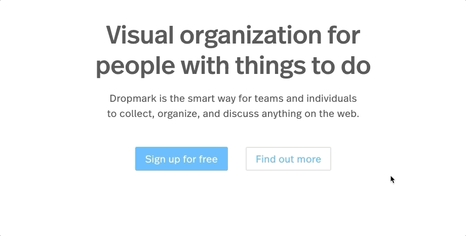
I am in awe of this surprising and super-complex animation. So engaging and impressive, right? I love when a beautiful illustration is combined with subtle, beautiful animation. Even if this animation doesn’t add too much to the user’s knowledge of the product, it definitely adds to the user experience. It makes the brand appear polished, lively, and modern. Perfect for software for team organization and collaboration.