Take a look at my favorite web designs I saw this month! This month’s collection includes:
- Home entertainment
- Creative hover
- Raw simplicity
- Elegant simplicity
- Fun in Norway
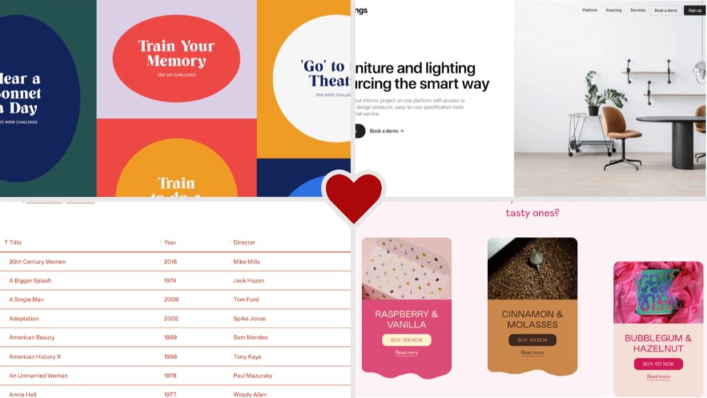
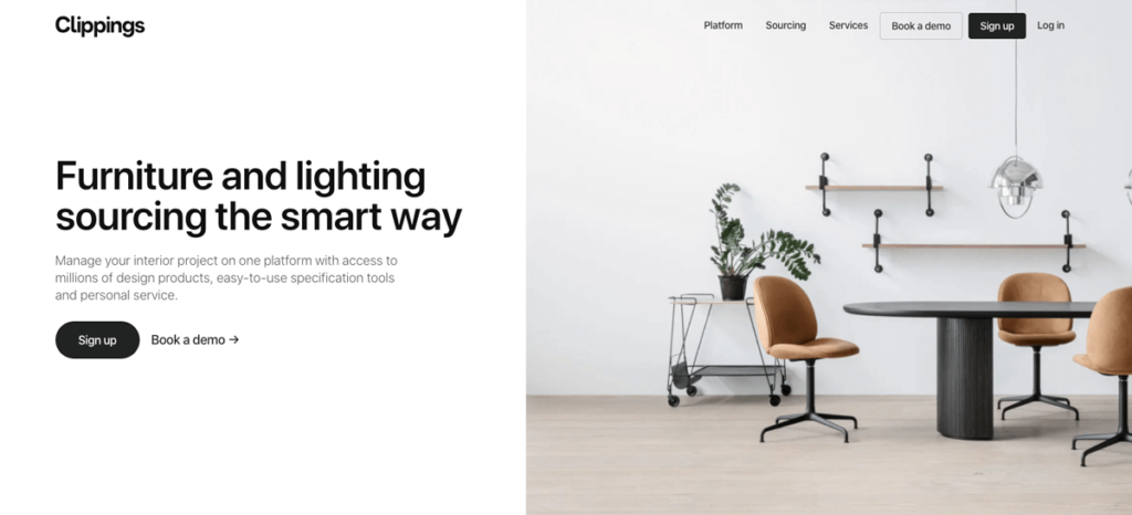
Home Entertainment
Bored and stuck at home? This site has the simple mission to give people great ideas of what to do when they are bored at home (or in quarantine). I love the colorful, cohesive design and how the shapes range from circles to ovals for each section. The varied heights of the grid items add interest as well. Try hovering over one of the ovals to see a nice rotation hover effect as well. Go ahead and explore and choose a challenge for yourself!
Creative Hover
I love the creative hover effect on these cards. It’s easy to apply the same old hover effect to every element. The background color on hover also indicates what category the link falls under – a nice subtle organizational choice. This inspired me to get creative and make something new! After seeing this, I added a fun hover effect to my portfolio page. I love finding inspiring designs like this and finding ways to apply them on my own site and for current clients.
Raw Simplicity
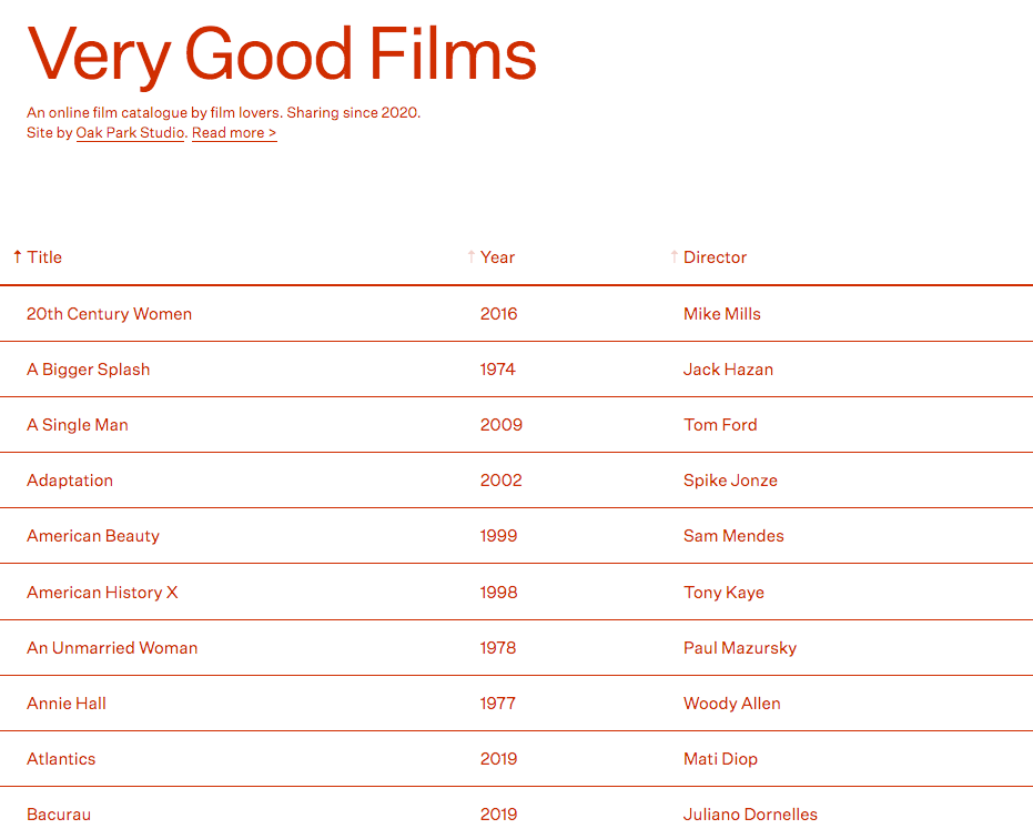
Sometimes a website has such a simple mission, it doesn’t need a fancy design to work. As a designer, it would be hard for me to choose this type of style for a website. However, this is a good reminder of how sometimes, simple is all you need. I don’t love the red text color choice used here. I’d be curious why the designer chose that color. Check out this minimalist, text-focused design celebrating good films and maybe try a suggestion or two from the list.
Elegant Simplicity
This design makes me feel calm and balanced. I love the simplicity and the beauty of each element. I like this kind of minimalism a lot better than the previous example. This design is minimalistic, while still maintaining elegance. The muted color scheme of dark gray, white, and light brown is subtle and used well throughout the page. Even the images all derive from the base color scheme, drawing everything together into a cohesive design. Images are layered gracefully throughout the page, sometimes with slight overlap to create a more organic, welcoming feel for the clean design. Want some calm in your day? Go ahead and browse this website.
Fun in Norway
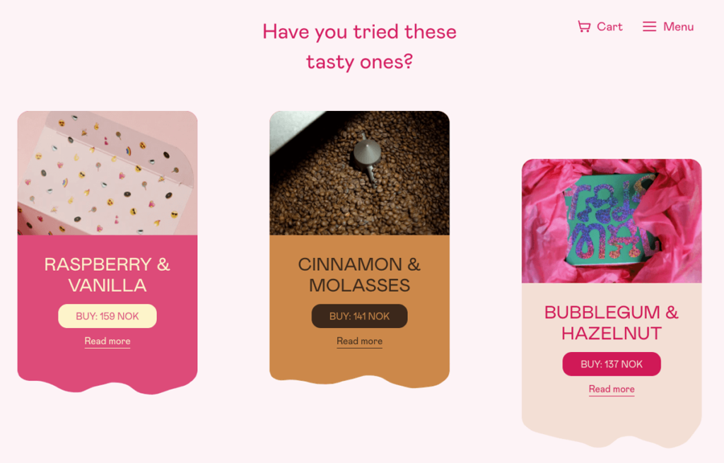
Okay, this website is just plain fun and I loved browsing through the pages. It made me wish I lived in Norway (not a normal desire for me) just so I could visit this cute little donut and coffee shop regularly. Please make a location in Denver!! The website design is fun and funky and incorporates that personality so many times throughout their site. The section in the screenshot above, for example, doesn’t exactly follow a grid layout, and the colorful cards have a wavy, animated bottom to them. I can’t stop clicking on things on this site. Every interaction is a new surprise and makes me smile. Take a look and see why I’m obsessed.
Did you enjoy these designs?
Subscribe below to get our bi-monthly email newsletter so you don’t miss articles like these!