Take a look at my favorite web designs I saw this month! This month’s collection includes:
- Imagery that makes me hungry
- Neon yellow used in an (actually) nice way
- Fancy brand uses hot pink – daring but original
- The most creative portfolio website I’ve ever seen
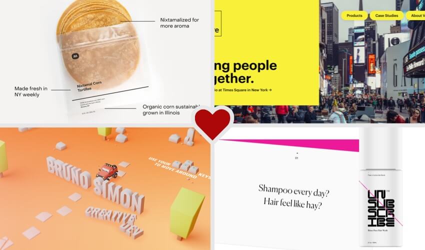
Imagery that makes me hungry
I don’t even like corn tortillas that much, but this simple yet detailed product shot makes me want to get some. I am in love with this minimalistic website that puts the focus on their beautiful product shots. Really, the only color on this site is in the images and video. All other design items use a nice, muted palette.
I also really like how many of these product shots include almost scientific-looking overlays pointing out the features of each item, and the mission of the company itself. This adds valuable information in an easily-digestible (digestible, get it??) way.
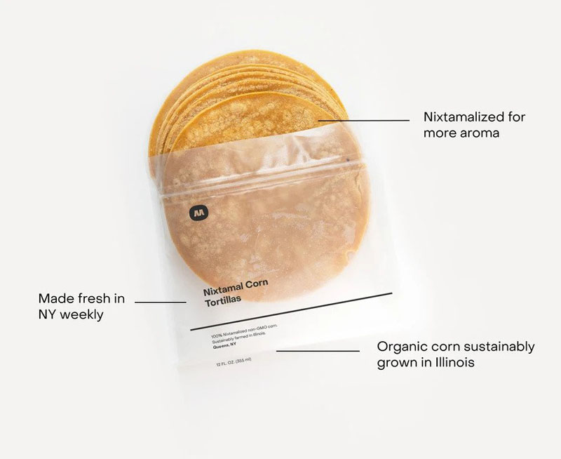
Neon yellow used in an (actually) nice way
Neon colors are dangerous and hard to use well. In fact, in design classes, teachers often warn you away from using these because unless you use them perfectly, you’ll hurt your users’ eyes. So when I stumbled upon this mix of brutally bright yellow combined with a standard hero header design, I was so impressed by the way they used this color well.
The design is creatively fresh and unique, and continues to use bright (but not quite as neon) colors in the rest of the page’s design.
Fancy brand uses hot pink – daring but original
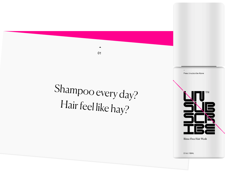
Often, “fancy” brands don’t include bright colors into their designs. But this upscale hair product brand uses hot pink in an almost classy way, don’t you think? Everything else on the site is black and white, so the hints of bright pink are a welcome addition that adds a little personality and flair to this brand.
I also love the way the product image follows you down the page as you scroll, and is incorporated into each main view. This breaks out of the standard section-by-section design and keeps you interested as you move on to each section. So creative and fun!
The most creative portfolio website I’ve ever seen
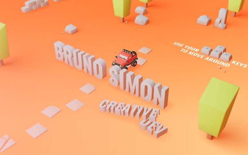
This is the most entertaining interactive portfolio site I’ve ever seen. You use your arrow keys to literally drive through the website. I admit, I’m the WORST at any and all driving games, and it took me way too long to get anywhere on this site. Believe me, I come in 12th playing Mario Kart almost every time.
But I’m guessing anyone with better coordination skills (that’s almost everyone) will be able to navigate this website easily and enjoy the amazing 3D effects used here. I love how, alongside the actual content of this site, there are random games like bowling on the way. This is gamification at it’s finest.